

H Wedding

GameSpark

Dough & Batter

Lucia Pizza

Portfolio 1.0
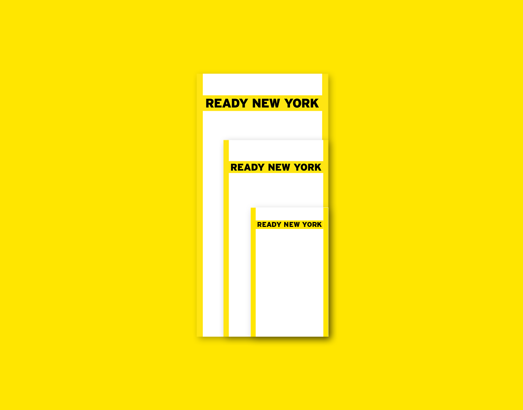
NYC Office of Emergency Management
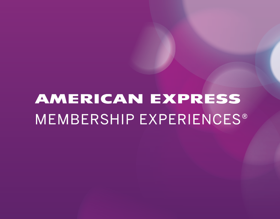
American Express Membership Experiences
American Express Reimagined

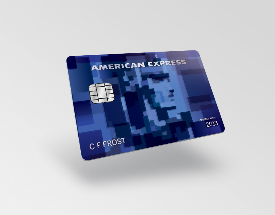
Amazon UK American Express Card
Yun Design
AIGA Centennial Gala

New York State Restaurant Association

Mezzo Labs
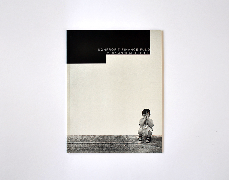
NFF Annual Report
COOP

Riverkeeper
Stuart Weitzman
Advantage Homes
namOO

blOOn

pixOOm